Sequest x LSE (London School of Economics)
2- week design sprint creating mobile app frames for a Masters’ student thesis
Overview
In March 21 we were approached by a Masters student at LSE who wanted to write a dissertation on carbon offsetting. The students' thesis is measuring how effective various data visualisations affect consumer interaction with carbon offsetting.
Ultimately, the thesis will be integral to our understanding of what data visualisations people are more receptive to when looking to carbon offset.
The screens were designed in Figma and would then be uploaded into Qualtrics were the student would then take control of the experiment and analyse the results.
My Role
My role was to design each of the frames in accordance to the student's requirements. I mocked them up on paper first and then shared grey-scale wireframes for him to analyse. It was an iterative process using Figma where the speed of feedback resulted in a short design sprint with the frames being finalised in under a week.
The Screens
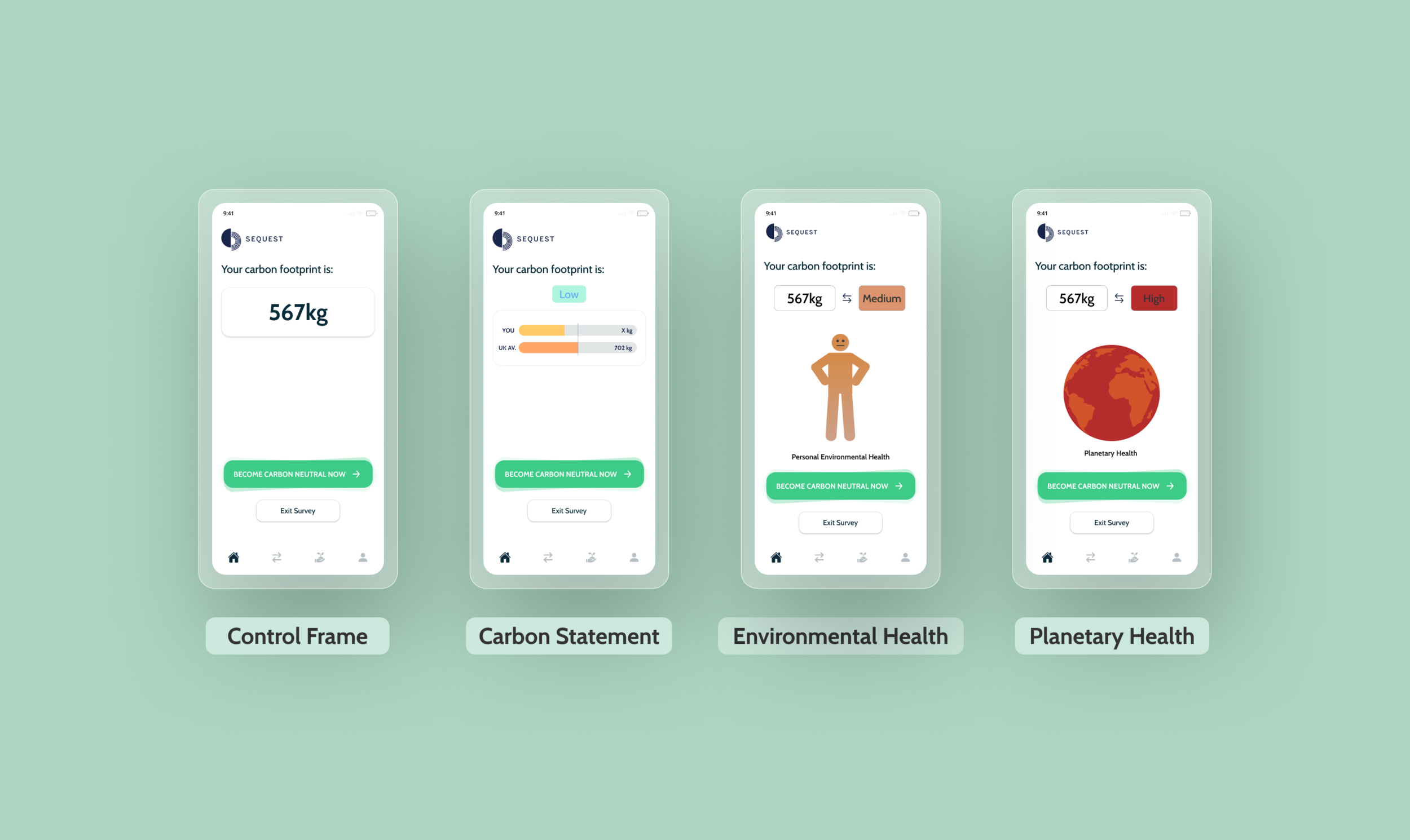
The four separate screens included the following detail
Control frame - single carbon score in kg of CO2 with no graphic.
Carbon statement frame – It frames an individual’s carbon statement in reference to the UK average, implicitly premised on social norms.
Environment health frame - here environmental health is likened to physical health. Simply, we are broadening our definition of a healthy life, marrying our internal, individual health with our external, environmental health.
Planetary health frame – similar to above. This frame, as well as the prior one, can therefore be seen as iterative to one another and differ in degree of tangibility (i.e., whilst they both emphasise the health of the planet, one does this through a more individualistic visual whilst the other visual is more holistic). This frame will be represented by a visual globe [see above].
The hypotheses are that all frames will be more effective than the control in (a) clicking to engage in carbon neutral behaviour and (b) the amount of money allocated to offset.

Results
The result was that the screen which was most effective in getting people to offset their emissions was screen 3 - The Environmental health frame.
Learnings
Consistent communication with the student meant for a very fast iteration process. I would work on the screens and share them in Figma where he would make comments.
Final few words…
I really enjoyed working on this project. It was the first time where I was working with a ‘client’ on my own. The results were really insightful and has influenced us to perhaps change our data visualisation screens on the main dashboard.