Sequest
5 months working as a UX Designer & Product Consultant at Sequest, a climate-tech start-up
Sequest are a start-up looking to make climate impact solutions more accessible to people. After leaving General Assembly in March 2021 I started working as a UX Designer and Product consultant. I was working on the web-app that allowed users to offset their carbon emissions with various projects around the world. As the sole product employee it was an exciting opportunity to really 'cut-my-teeth' within a start-up environment. The end result was producing a beta product ready for release to people who had signed-up for the app.
The Product: How it works
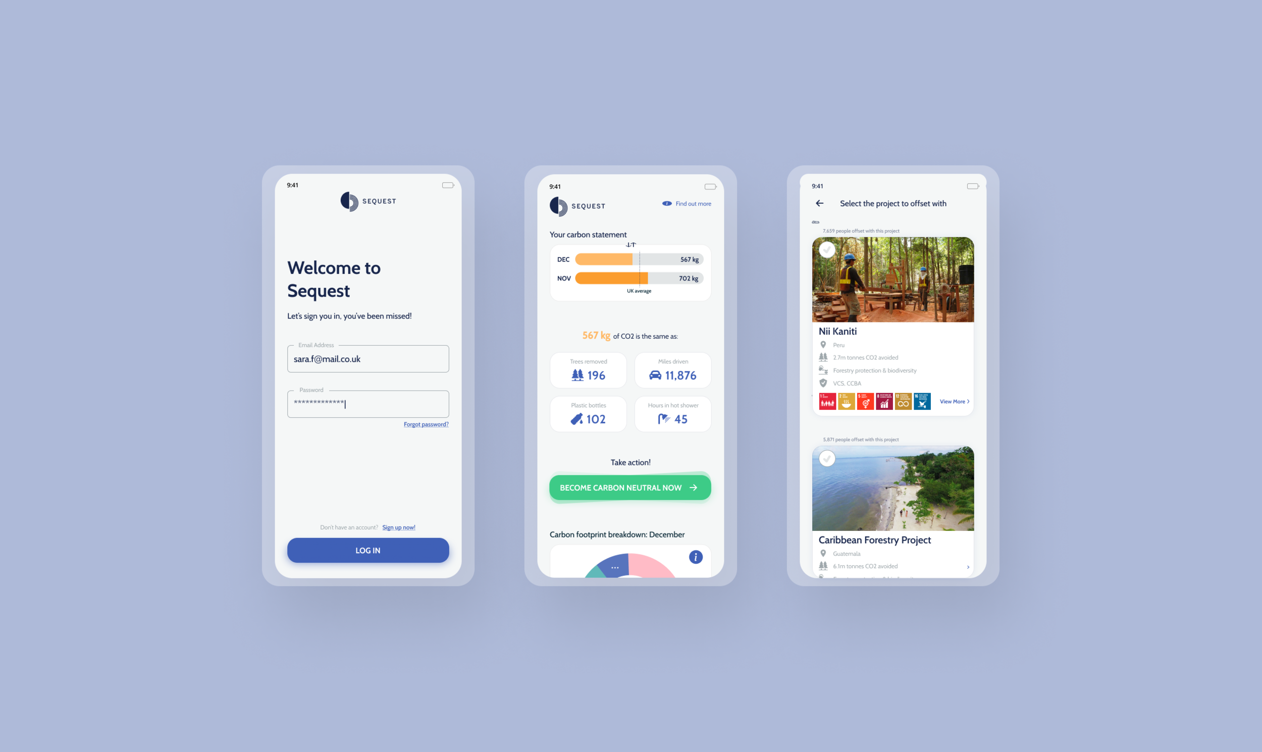
The web-app follows a single user flow where users connect their bank accounts, calculate their carbon footprint and offset their emissions with projects around the world.
Users are invited to connect their bank account(s) via open banking (Plaid).
Once a connection has been made, Carbon Analytics (third party carbon calculator) analyse the transactions and provide the user with their personal carbon score.
Users are then invited to offset their carbon emissions with various impact orientated projects around the world via another third party, Ecosphere.
My Role
I was told before joining a start-up that my role would be very versatile. There are many overlaps between UX Design and Product Managers so there were times where I would be doing both:
Conducting extensive user research into people's habits and experiences around sustainability
Product managing the app during the beta phase. This included working alongside a team of developers and designers at Tech Alchemy, the development studio that were responsible for the initial app design.
Repeatedly user testing the Sequest app - I would then mock-up designs based on the feedback and relay my thoughts and recommendations to Tech Alchemy, the agency.
Designing the websites for the different sides of the business using WebFlow & Figma. (See other projects for more detail)
Responsible for the marketing strategy by creating A/B tests on Social Media, designing the content and managing the CRM system (HubSpot).
Before I begin…
Now, during the course at General Assembly I was taught a very methodical double-diamond process where each step was carefully mapped out with instruction along the way. My experience at Sequest wasn't quite the same...
I learnt pretty quickly that it's very scrappy when working in a start-up. When asked to do something you just get on and do it. If I didn't know something I had to research it in various books and websites. I was the sole product contact, responsible for ALL things design from websites to marketing material.
UX Audit
The first thing I did was conduct a UX audit on the product that was produced in May. The key areas of improvement were;
Text size was far too small and inaccessible
Colour contrasts often failed accessibility guidelines. Instructed design agency to increase saturation of the colours to make sure they were accessible
Ensure there weren't any typo's in the copy
Make sure that all of the bugs had been identified and removed from the beta version
On completing the UX audit I fed back to the development agency with a list of actionable changes to make.
User Research
As the changes to the app would be done in sprints I had an opportunity to do my own research. I wanted to establish some direction for who our target users were as this would be vital for the founder and his business strategy. Prior to arriving at Sequest there was some research however I wanted to conduct my own research into the problem space to make sure I had an understanding of how users perceived sustainability and to see how users were helping limit the climate crisis.
The founder of Sequest also wanted to do some research into people's association with sustainability and banking. To understand if there was an opportunity to position the product as B2B as opposed to the app route.
To do this I used two user research methods;
A survey to paid participants to ensure I wasn't getting bias opinions from my own network.
User interviews off the back of the survey from people willing to speak to me about their own experiences and habits.
Survey
The survey was designed before I arrived at Sequest. The questions were mainly based around the relationship between sustainability and banking.
My research aims were therefore two-fold; to establish my own understanding of people's behaviours towards sustainability and also to see if there was an opportunity for the product to pivot towards a B2B service.
Paid access unknown survey responses. 414 respondents.
90% of respondents think banks and businesses should take responsibility for environmental impact
Only 33% have knowledge of how banks work with green issues
75% want banks to help them live more sustainably
User Interviews
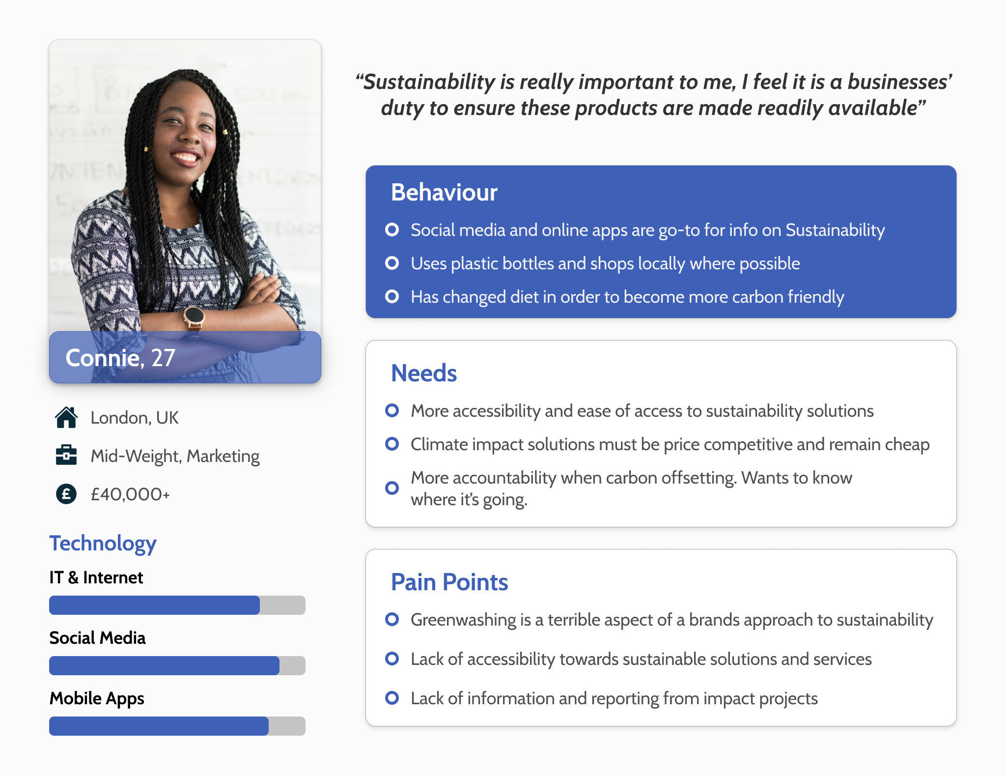
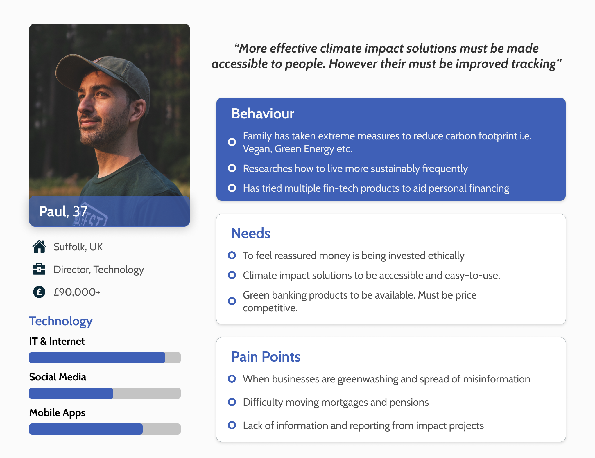
I selected the interview candidates from the survey results. Off the back of the interview findings I created two persona's in order to target our marketing as well as future features. That way we were being focussed in our design strategy.
“(Sustainable Banking) seems like such an obvious choice to have this service”
“I haven’t looked into carbon offsetting as I’m skeptical about where the money is going, there isn’t much tracking or reporting”
Persona’s
Meet Connie and Paul!
I wanted to include two different persona’s as it was important to realise that our competition wasn’t just young people in their 20s or early 30s. This is an issue that effects multiple generations. The main barrier that stops people from living more sustainably is money.
Marketing Strategy
Whilst Tech Alchemy worked through the design changes it was time I put my marketing hat on. One of the first tasks was to set up a CRM system so we could manage our customers. We recruited our customers by building social ads that would have a CTA button that would redirect people to our landing page. I had created a landing page (see other project) that instructed people to enter their email address if they wanted to have access to the beta version of the app.
We have c. 500 people on our CRM database. Our marketing strategy was to release the app to 50 users for 2 weeks to stress test, then up it 100 users every 2 weeks. We would then monitor how users were interacting with the product on Google Analytics.
This strategy changed after speaking to my mentor, Jamie. He advised that we should test our assumptions through 1-1 user testing as opposed to releasing it to lots of people. By testing our assumptions we could measure through both quantitative and qualitative methods. This would give us answers much faster than seeing it through google analytics our selected KPIs e.g. bounce rates and time on site.
Marketing Material
We had different marketing campaigns;
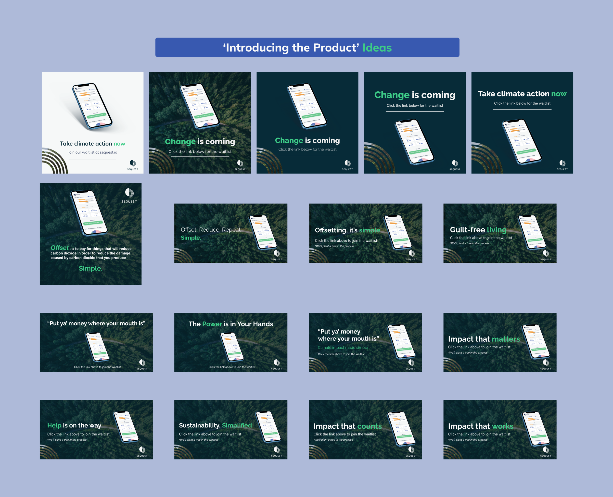
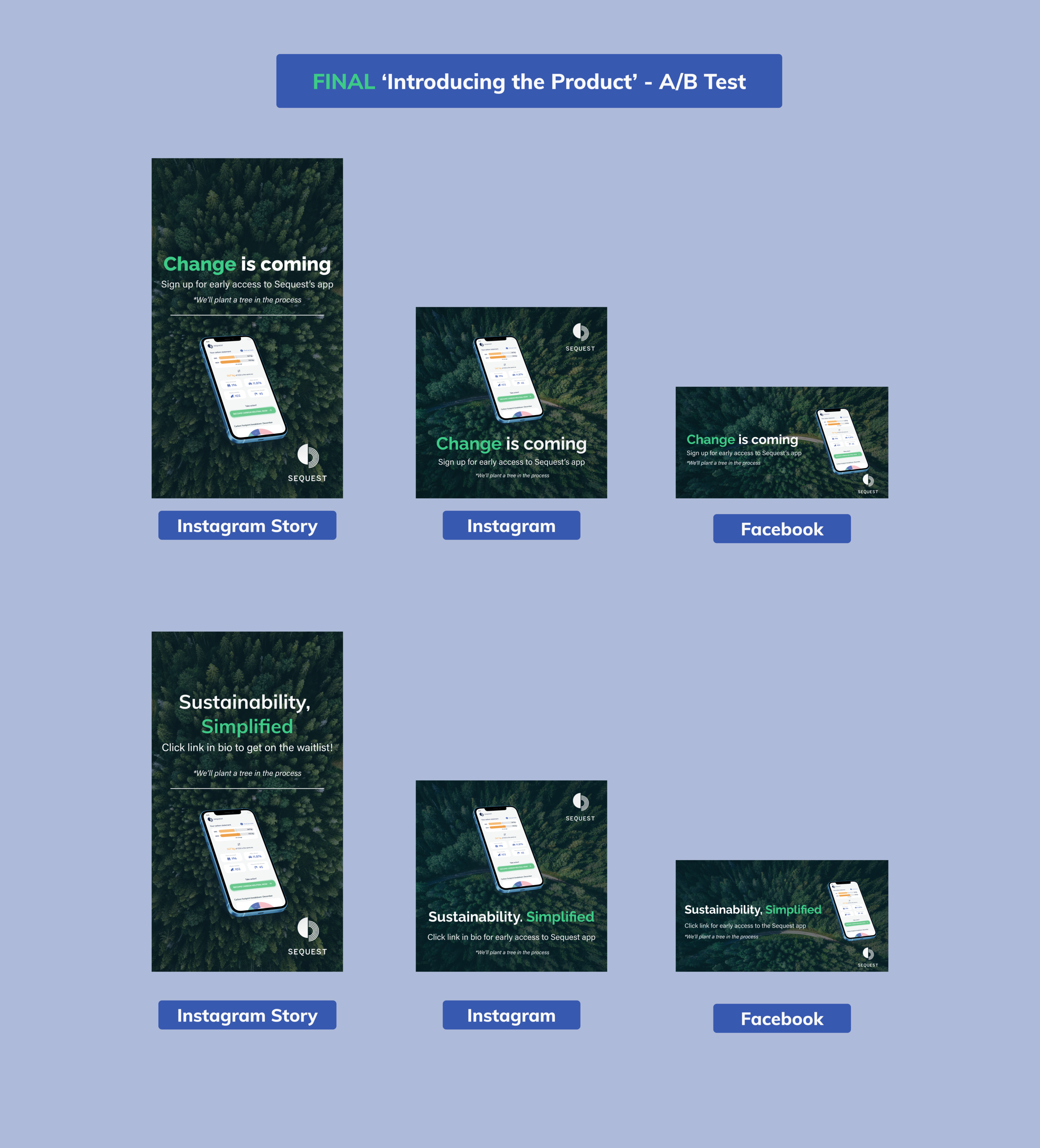
Introducing the product - 'Change is coming' - trying to get some hype for the product pre-release. Goal was to push traffic towards our landing page. This message was A/B tested on facebook against different copy 'Sustainability, Simplfied'.
Recruiting user interview candidates - We wanted to reach out to our followers on Instagram and Facebook as we wanted to speak to people concerned about climate change. Our initial interview candidates were taken from the survey and were selected based on their answers. Whilst it's important not to cherry-pick candidates that reaffirmed our own views, we wanted to speak to people who had changed their habits to be more green.
Testing Our Assumptions
Speaking to Jamie was really insightful, he nit-picked the product and worked out what his advised release strategy would be. I hadn't come across 'Assumption Testing' before so it was interesting to here the process.
Going through the user flow, I wrote down every possible assumption we could make about the product and ranked them on;
Likelihood of it NOT happening (1-5) 5= High
Impact of it NOT happening (1-5) 5 = worst
We then worked out what the best way to measure these things are, either through quantitative measurement or qualitative.
The top rated 'risks' were;
We assume that users want to offset emissions via the app as opposed to an add-on to existing service
This was vital. This challenges the whole point of the service. This should really have been approved and tested prior to the build however there was no point deliberating over it now as the app had been built. To test this was simple, do people offset and will they offset repeatedly every month.
KPI - No. of offsets vs bounce & No. of repeat users
We assume that users feel comfortable connecting their card
This was also very important, we established that smaller brands were less trusted in the user interviews. Are users going to feel comfortable connecting their card details. To remedy this, we wanted to reassure users more in the onboarding screens on the security of the card connection process.
KPI - No of people who connected their cards. %. of people who bounce at the card connection stage
Result
It was a great way for us to really focus on what are the major risks at play. That way we could try and mitigate the risk through design. Our plan was to measure these assumptions in 10 user tests. We would then count the number of people who passed a various stage. Then we would follow up with 'why' they did a certain action after the test.
User Testing
After a few weeks of making adjustments to the MVP, we had a fully-working product. I selected 10 people from our CRM database whom I knew would be good candidates to run the test with.
The Task
“Your task today is to create a new account, connect your bank account(s) of your choice in order to achieve a personalised carbon offsetting score.
Once you have received your score you will have landed on the dashboard. From here we ask you to offset your carbon emissions with a project of your choice.”
Key Findings
Poor UX on the opening login page. Users went straight to enter details on login page without creating an account
There was some friction with users connecting bank details via Plaid (3/10). Users felt unsure on sharing bank details with a new business. Lack of trust with the Sequest brand.
Confusion over the different categories on the dashboard. Users unsure on what 'services' or '_____' was
The Problem
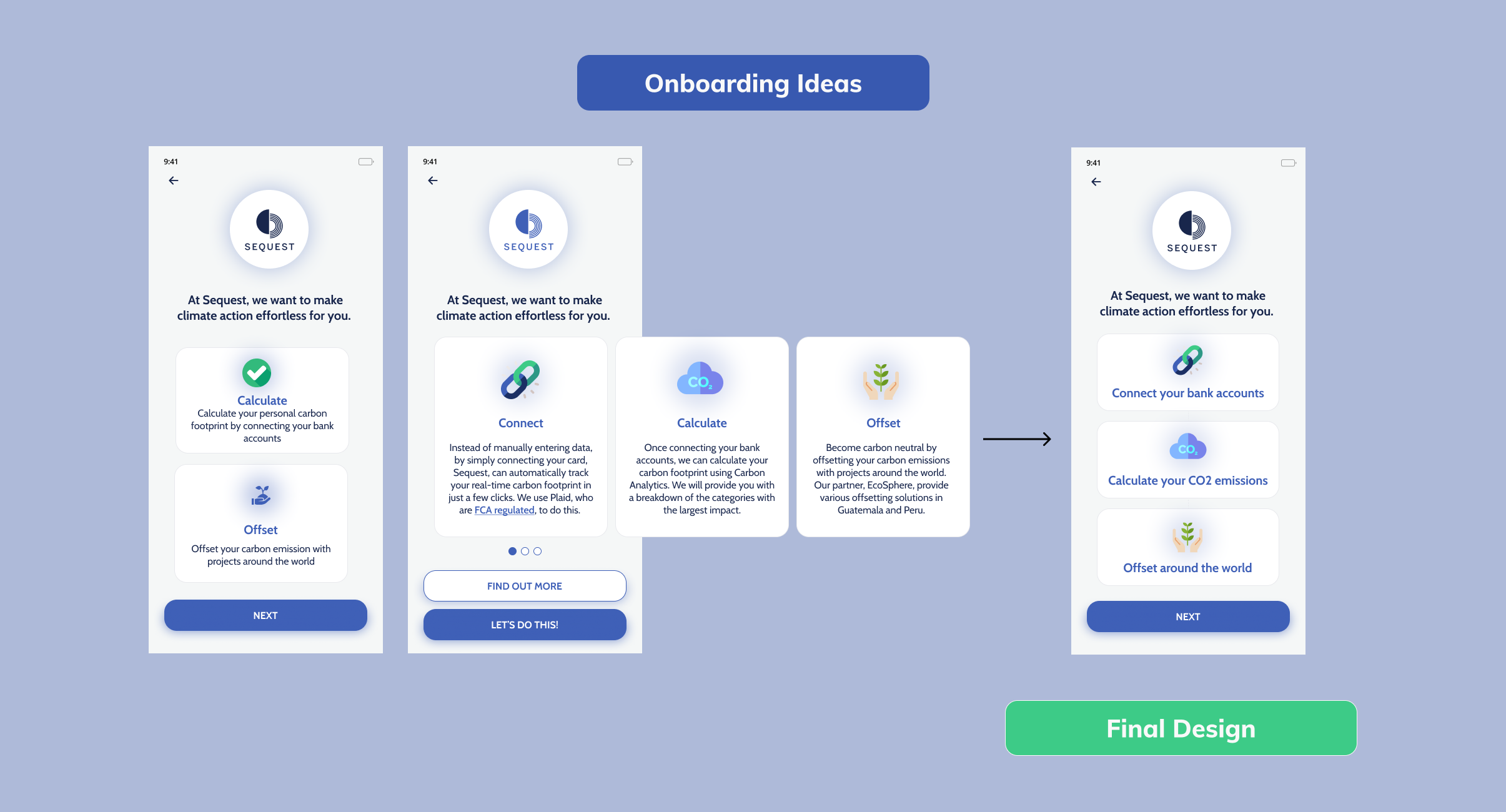
Offset feature had not been introduced prior to dashboard. We needed to build an additional onboarding screen that showed the 'jobs-to-be-done' method of showing the user what the main task was for the app.
Upcoming Changes
All in all, the app worked. It didn't crash, it was in working order. As a designer I presented the findings back to the founder who agreed that the customer journey would be improved if we made the following changes;
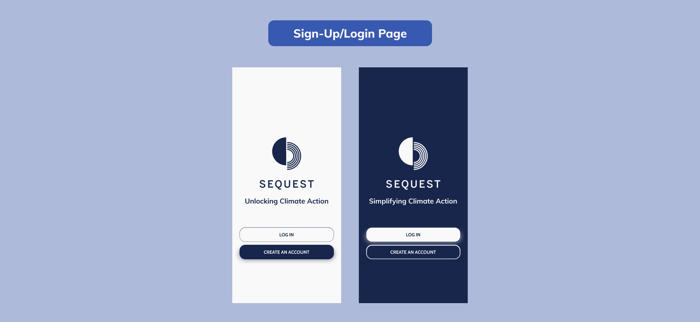
A page right at the beginning with no form fields. Just two buttons with Login or Sign-up. This should clear up any usability issues at the start with the user having to click sign-up below the login fields
An additional onboarding screens that simplified the functionality of the product; 1. Connect 2. Calculate 3. Offset with brief descriptions below
Information button on the category page to detail what transactions fell into which categories
