Unsure on where to store your Crypto’s? Try Gridlock
3-week design sprint working on a Cryptocurrency storage app
Who are Gridlock?
Gridlock is a mobile and web app that facilitate the storage and management of cryptocurrencies via online storage (soft wallets).
The USP of the product is increased security made possible by splitting the wallet encryption key into five pieces and distributing those pieces to friends and family called Guardians.
The Brief
Redesign the existing desktop design from a mobile-first perspective in the form of a mobile app
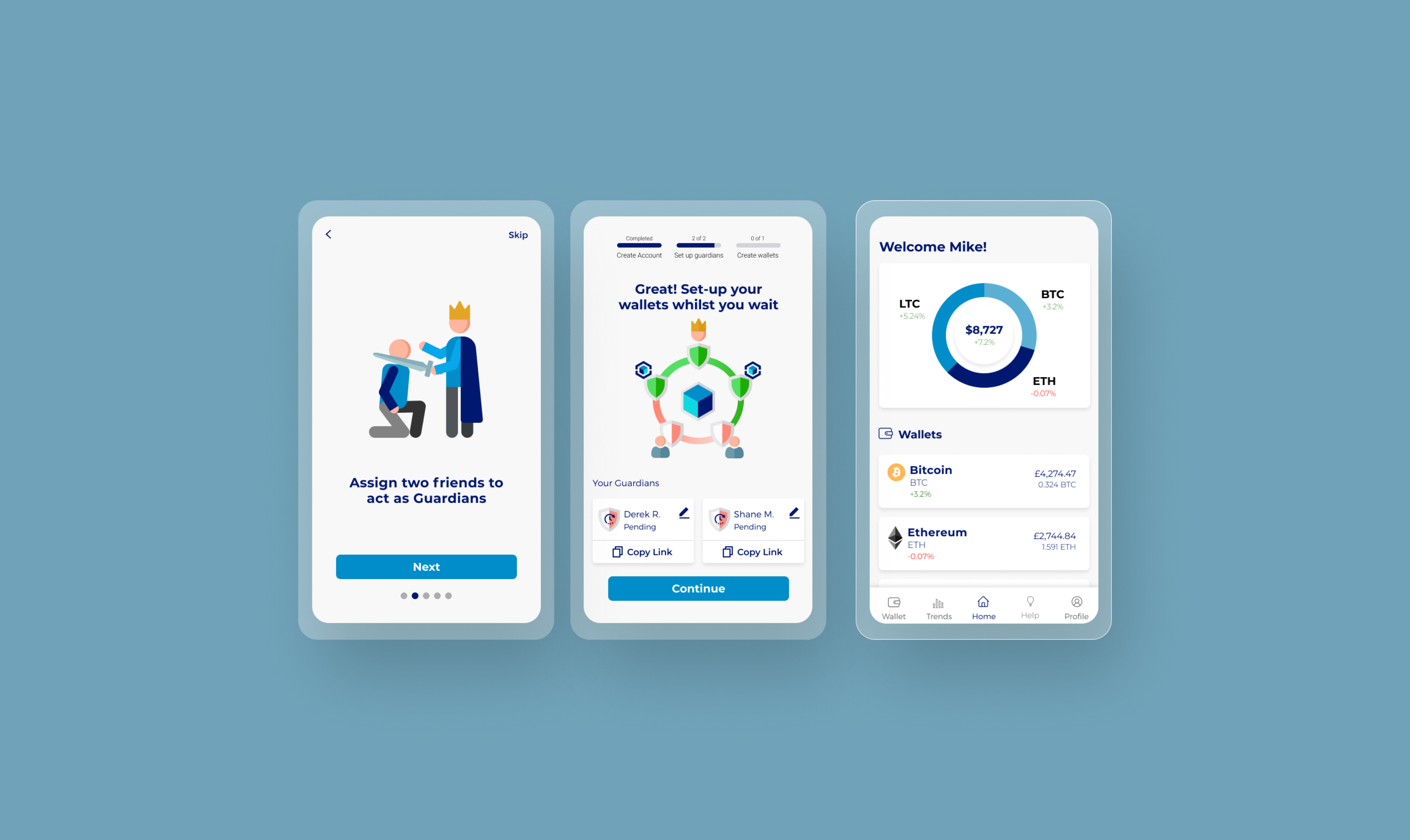
Design the onboarding and sign-up process that clearly explains the confusing concept of the Guardians
Design the dashboard once the user has completed the sign up process
The Problem
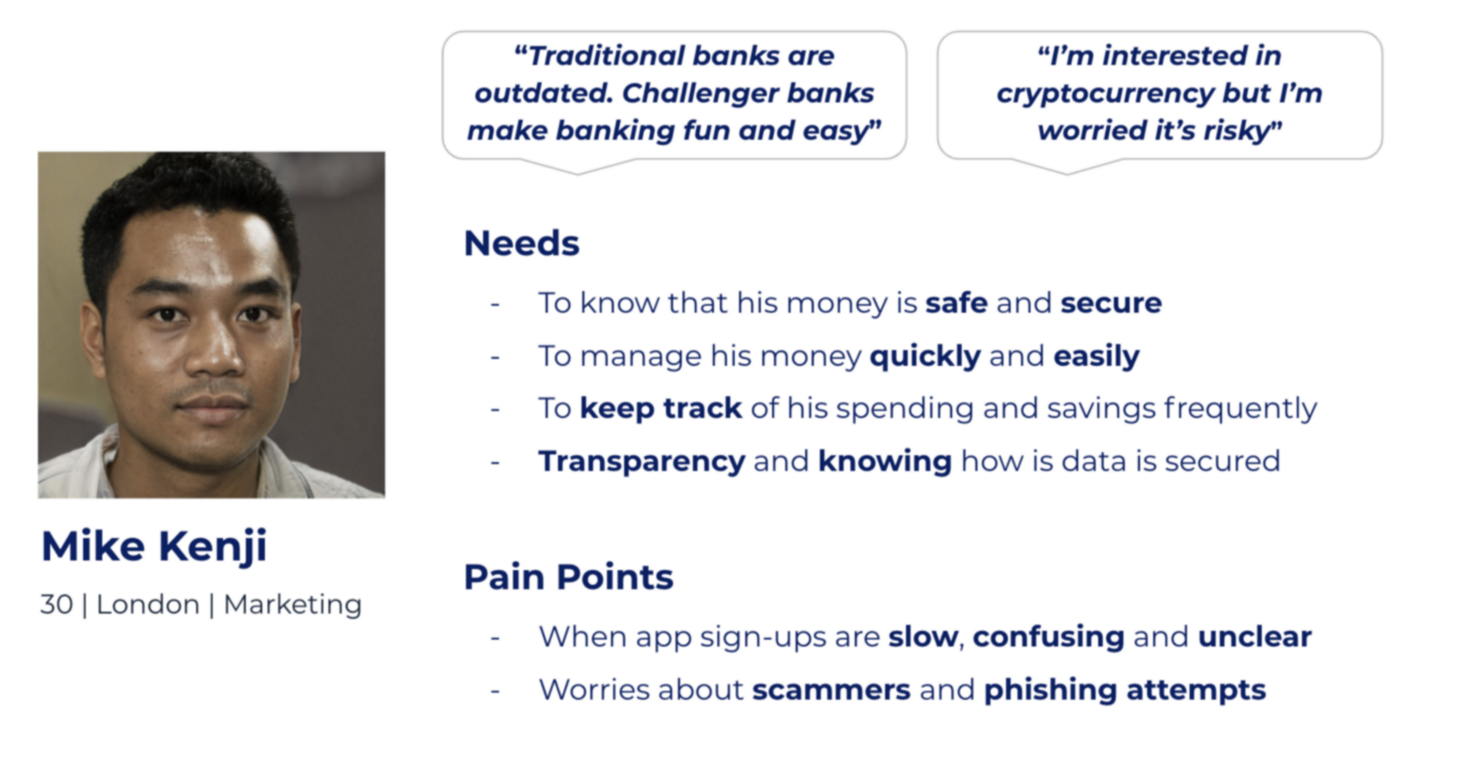
Cryptocurrency is often considered as confusing and risky. As a result, Mike (persona) needs a clear and easy understanding of how Gridlock will keep his Cryptocurrency safe throughout the onboarding, sign-up and dashboard because he wants to feel reassured that his assets are secure and easily accessible.
My Role
For this project I facilitated the design sprint from the discovery phase (research) through to the prototyping on Figma. As part of a team of four, we each got involved in all aspects of the double-diamond process as mentioned below.
As I’m interested in fin-tech platforms, naturally I was keen to oversee the research phase, conducting competitor analysis on other cryptocurrency platforms and challenger banks such as Monzo and Revolut.
Discover
Understand the users, understand the competition
We sent out a survey to gather quantitative data on how users felt about Cryptocurrency. We received 103 respondents from the survey. From there, we identified 16 people who we felt would be good for user interviews. Key Findings:
Cryptocurrency seen as volatile due to the lack of knowledge
Online Banking - Challenger banks are enjoyable to use due to dynamic and creative features
Trust & Security - Good transparency and communication is key to instilling trust in users
Competitor Analysis
We were specifically looking at the onboarding and the dashboards. Key Findings:
Onboarding
Use fun illustrations to accompany text - helps explain and simplify the jargon
Dashboard
Using cards to break up content on the dashboard
Infographics really help engage the user
Define
Synthesise the data into key insights
Security — Gridlock is essentially a bank and therefore security is paramount
Accessibility — We had to ensure we were designing for users with a range of experience. Our content, UI and explanations had to be accessible for all
Clarity — To ensure our users trusted us, we had to make sure we were clear and transparent with how Gridlock worked
Develop & Test
Test, Iterate, Repeat
We took three ‘How Might We’ statements into the design studio. Along with the clients, we ideated how we were to imagine the onboarding, Guardian sign-up and the dashboard. Once we we agreed on the best solutions, we created a low-fidelity prototype in Figma to begin the user testing.
Recurring Problems
We had three rounds of user testing after each level of fidelity. To summarise, we had three recurring design challenges:
Users were having trouble understanding the ‘Guardians’
We needed a seamless flow to allow users to contact potential Guardians
Users were eager to explore the app but they needed to set-up ‘Guardians’ before they could access the app
Trouble with Terminology
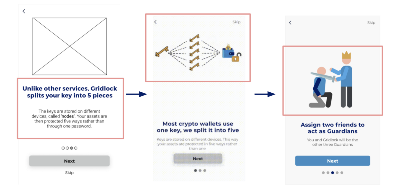
Onboarding: Explaining Gridlock - We were having trouble explaining Gridlock in the clearest way with the least amount of text. Removing terms such as ‘key’ and ‘nodes’ and just using ‘Guardians’ made everything much clearer. Adding fun illustrations also made the concept much clearer.
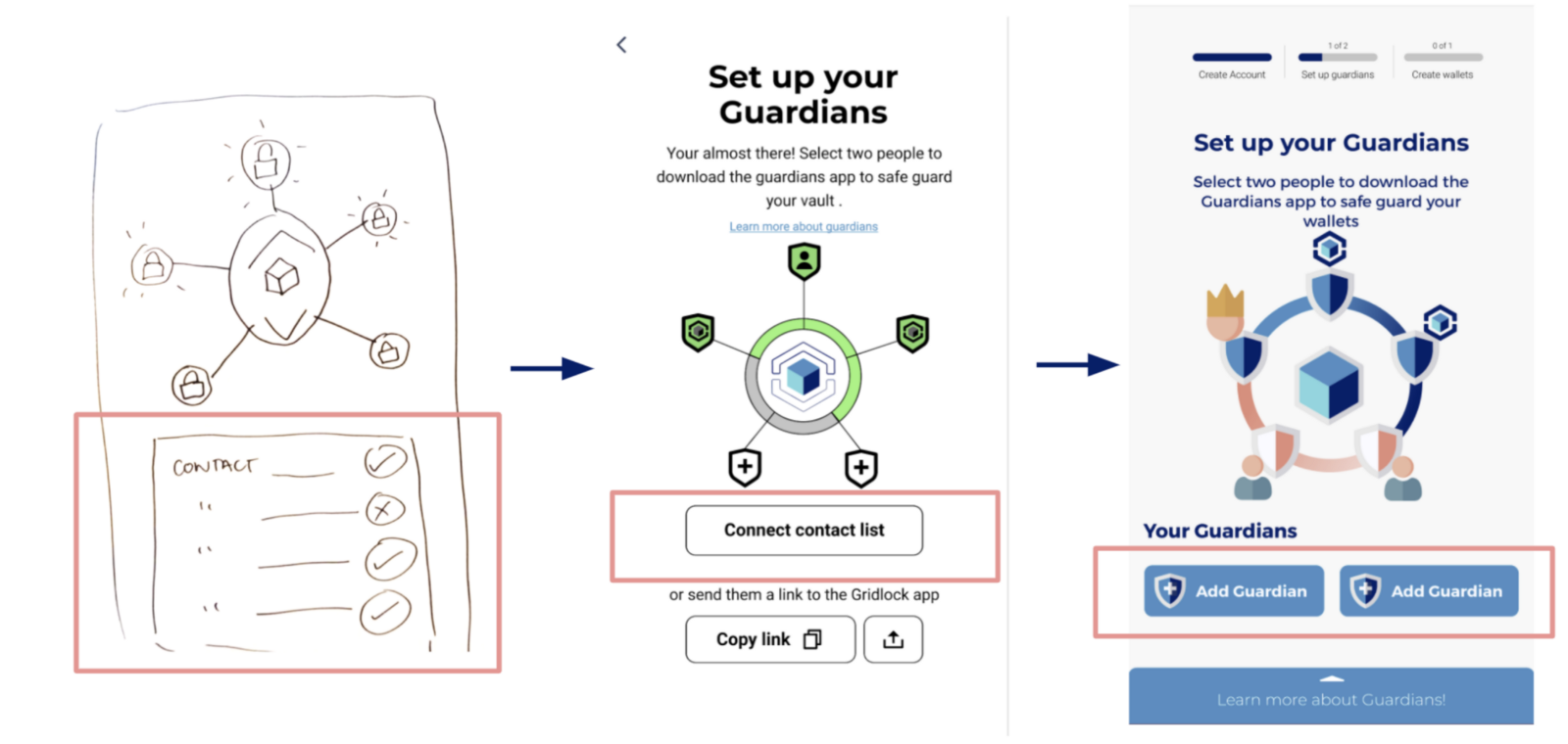
Assigning Guardians… not for the Galaxy
Issues with the Guardian set-up - Users were reluctant to sync their contacts from their phone. Instead of syncing users contact list, we created a new flow that allowed users to use third-party messaging services to contact their Guardians.
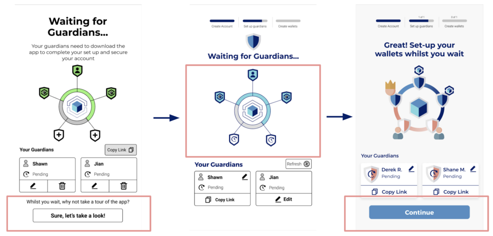
Waiting for Guardians to Accept
Waiting for Guardians - Getting the Guardians to accept the request was a very manual process which could take up to a couple of hours. We allowed users to complete the Guardian set-up process instead of making them wait.
Deliver
Once we had completed all of the tests, we finalised the high-fidelity prototype on Figma.
Next Steps
As we handed over the design to the team at Gridlock we included some next steps.
Create the Guardian app onboarding pages
Implement a ‘freeze your wallet’ feature that came up in the design studio
Design additional pages on the navigation bar
Design for desktop and tablet
Learnings
As Steve Krug said, designing screens is very similar to designing billboards. It’s important for information to be scannable, not readable.
Working on a client brief as opposed to concept projects made me focus much more on the business problems and also designing what was feasible.
Don’t worry about not being an expert in a certain field. At the beginning we were quite daunted about working with cryptocurrencies. It actually turned out to be a blessing in disguise as our inexperience really helped us empathise with users.
Final few words…
Overall I really enjoyed the project, I was nervous before doing it as there was a lot of hype around the client projects. I really enjoy facilitating group projects, it helps me get much more involved and also allows me to use my organisational and communication skills.
It was great to get experience working on a fin-tech product. I find the financial sector of technology really interesting considering it’s been so disruptive over the last couple of years. I hope having this project on my portfolio can help me move into the fin-tech space in the future!
